Instagram changes logo for first time in a decade. It sucks.
3 sources·Updated August 13, 2026
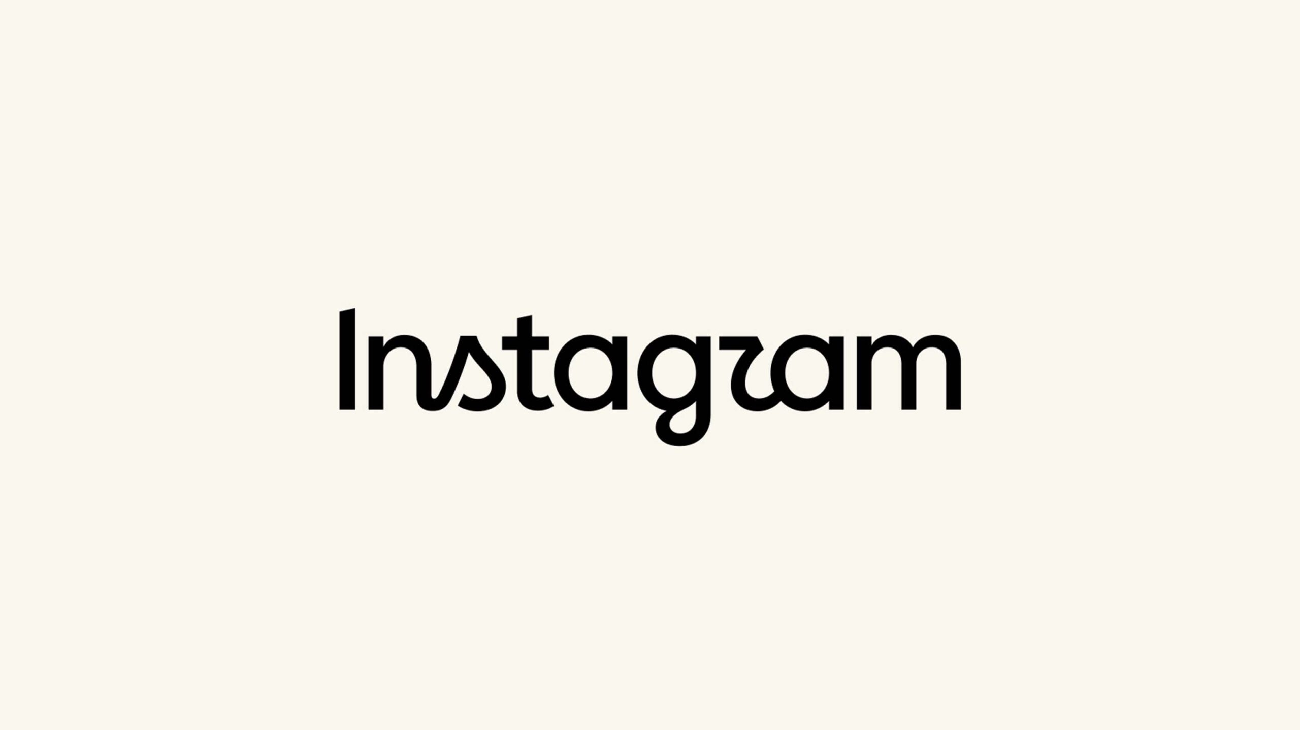
Instagram logo change
Covered by 3 sources
- ET Tech·8h agoInstagram introduces new wordmark after a decade, logo to be unchanged
The redesign replaces the platform’s familiar cursive lettering with a hybrid style that combines more conventional typography with script-inspired curves. Elements of the letters, including the “s”, “r” and “g”, retain a distinctive stylised treatment.
Read at ET Tech → - TechCrunch·10h agoInstagram introduces a redesigned wordmark
The social media giant says it was time for a sharper and more modern look after a decade.
Read at TechCrunch → - MobileSyrup CA·10h agoInstagram changes logo for first time in a decade. It sucks.
Instagram is redesigning its decade-old wordmark, and the new design is certainly a choice. For about the last ten years, the Meta-owned social media app has had a wordmark with a cursive-style font. That’s changing now, according to Instagram head Adam Mosseri, who shared the…
Read at MobileSyrup CA →